Installation
To install the plugin, please refer to the “Installing a plugin” documentation.
Layout Block
The Layout block serves as a container for advanced layout elements.
You can insert either a Columns block or a Grid block into it.
Columns Block
The Columns block allows you to create flexible column systems.
- Easily adjust the width of columns.
- Set different widths depending on screen size.
- Align content vertically and horizontally.
- Set the spacing between columns (gap), horizontally and vertically.
The Columns block is a sub-block of the Layout block.
Column Block
The Column block is the only child allowed in a Columns block. It can contain all types of blocks.
Parameters per column:
- Show or hide the column (useful for creating margins).
- Set the width of the column (several units available depending on the theme).
- Change the order of the columns (reposition the columns).
Grid block
The Grid block allows you to organize elements in a grid format.
- Contains only Cell blocks.
- Define the number of columns (max. 12) and rows (max. 12), with the option to adjust according to screen size.
- Adjust the spacing (gap) between cells in the Dimensions section.
The Grid block is a sub-block of the Layout block.
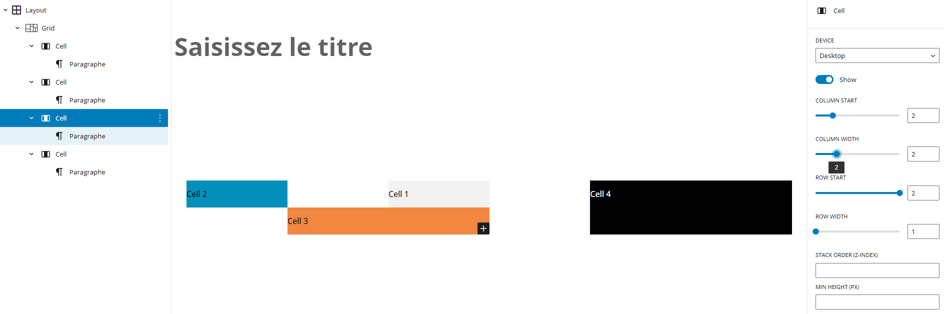
Cell block
The Cell block is the only child allowed in a Grid block. It can contain all types of blocks.
Parameters per cell:
- Start column and width.
- Start line and height.
- Overlay order (z-index).
- Minimum height.
Advanced Group
The Advanced Group block builds on the features of the native WordPress Group block and takes them much further: it includes a wide range of CSS properties and allows precise, responsive control of styles for every screen size. This provides maximum flexibility for creating complex, customized, and fully adaptive layouts without touching any code.
Personalization
By default, three screen sizes are available:
You can change screen sizes to manage responsive.
The changes will apply to all blocks on the site.
The “lg” size defined with “Gutenberg Advanced Layout” is reserved; you can only modify its label.
The “sm” (mobile) size is set to “autoStack” to force default stacking of columns and cells.
To add a new screen size, copy the following code into your child theme’s functions.php file:
To delete a screen size:
To change screen size:
To force stacking on a specific screen size:
CSS Variables — Reset & Manual Definition
Why Manage CSS Variables
The plugin uses CSS custom properties (CSS variables) to enable dynamic styling of blocks (colors, spacing, etc.). Because CSS variables are inherited from parent elements, a style defined on a container can unintentionally affect nested blocks.
When working with nested layouts (columns, cells, grids, etc.), it often becomes necessary to:
- stop inheriting variables defined by a parent so the child block starts from a neutral baseline,
- or explicitly define new variables on a specific block to style it independently.
Gutenberg Advanced Layout provides controls in the advanced settings of each block to handle these situations.
Resetting Inherited Variables
The Layout and Group blocks include an option in their advanced settings that allows you to reset specific CSS variables.
This stops the propagation of variables defined on parent blocks and prevents inherited styles from affecting child blocks.
When entering variables to reset, the following shortcodes are available:
[allbreakpoints]
Automatically expands the variable for each breakpoint prefix configured in the plugin.
Example:--gap-[allbreakpoints]: unset;will generate one line per breakpoint.[allpadding]
Expands the variable for:p-t,p-b,p-l,p-r.[allmargin]
Expands the variable for:m-t,m-b,m-l,m-r.
These shortcodes make it easier to write series of variables without having to enter each one manually.
Manual definition of variables on a block
All blocks can manually define CSS custom properties from their advanced settings.
You select:
- the variable name (e.g.,
--section-bg), - the value to apply (e.g.,
#fafafaor20px).
This feature allows a block to have completely independent styling, useful for:
- changing the colors of a section,
- applying specific spacing,
- fully isolating a block’s styles even when it is nested.
The previously mentioned shortcodes ([allbreakpoints], [allpadding], [allmargin]) are also available to automate variable generation.